Wednesday 1 April 2015
Final Production Diary
During this project, I have learnt new skills within the
software Premiere as well as the typical and successful conventions of the
products: a music video, a magazine advert and a digipak.
Before I started this project, I had limited knowledge
regarding these productions. Although I watched many music videos, I was
unaware of what made them so successful. At the beginning of A2 I already
started to learn the different approaches directors took when creating these
particular videos, which varied from a ‘parallel universe’, a ‘manipulation of
narrative time’ to time lapses. Straight away this gave me ideas about my own
music video – I took into account the locations and equipment which would be
available and the people I could ask to be my actors. Throughout the course, I
continued to learn a lot about music videos such as the theorists which comment
on the aspects like Andrew Goodwin. By learning about these theories, I was
able to use some of the aspects these theorists talk about in my own work such
as ‘relation of visuals to song’. This meant I was able to link the lyrics of
my chosen song to the footage I filmed for my video. The entire process of this particular project did prove to be quite difficult, especially when comparing it to my foundation portfolio. Most of this was due to the new software Premiere and learning about the wide variety of tools I needed to learn and use, especially how to edit the green screen scenes. The whole project was also very time consuming, and if I could do my music video again I would organise my time more efficiently as I didn’t predict how long my entire music video would take me. Filming was also a new activity. Compared to last year where I only had photo shoots, filming needed a lot more preparation. This is something I will consider for the future, if I ever take on any filming projects.
My magazine advert and digipak were also significantly important. Over the past couple of weeks, I have been focusing on these products, particularly my digipak. I found this ancillary task a lot harder than I imagined as in order for it to look professional, a lot of research had to be carried out. I often found myself going over my research tasks and searching for further examples to help me with my work. I also feel the particular genre ‘rock’ is a hard genre to professionally display on a digipak. This is why I also looked at previous albums and digipak examples from The Pretty Reckless for inspiration, and used professional-looking photos from my photo shoot. I also believe the photo of my magazine advert was the main professional aspect and over the past week I have been alternating the fonts to make it more realistic.
Recently, I have also been looking at my blog as a whole. This included using the appropriate labels for each posts and creating any planning posts that would help to show the development of my tasks over time. This is why I made a post displaying the alternations I had made along the way, especially during the editing process, and raw footage. I feel this post in particular would show how important editing was in regards to my video.
The last thing I did before finalising my products was ask
my fellow peers and members of my target audience for advice and improvements I
could make. I then started to develop my evaluation answers and present them on
different platforms. With my audience feedback I was able to add more
information to my third evaluation question, and then present this on iMovie –
this would be one Software I could use for my final evaluations. For question
one and four I used InDesign to present them as a magazine format. I did this
as I am now very familiar with the software plus it looks interesting to
present questions in this way. For my second question I used Prezi, with
appropriate pictures to link to each section of the question. As I had already
drafted my questions, making improvements and placing them into a different
document was quite easy. This proved how important the drafting stage of the
evaluation was.
Overall, I am happy with my products as I feel they all
include a similar house style and it is easy to see how they group together to
represent one particular artist/band.

Audience Feedback Survey
Create your own user feedback survey
Please fill out my survey regarding my latest music video draft, thank you!
Please fill out my survey regarding my latest music video draft, thank you!
Alterations Made Along The Way
Before:

After:

Behind the Scenes of the Performance
This is a time lapse of the footage from behind the scenes of the performance in my video. In this video you can see the lighting I used, as well as the location I filmed - the drama studio. Within the video, there are also parts where I get closer to my model to film close-up shots and I also use other equipment including a tripod to achieve a steady shot. Towards the end, I reduced the lighting significantly as I wanted to created a shadow outline effect using only one light in the background.
Brand Guidelines
These are the brand guidelines, which my audience will be able to recognise and link to the band 'The Pretty Reckless'. In this PowerPoint I discuss my logo, typeface and colour swatches in terms of the advertising and branding for this particular artist and how they create an overall house style. These guidelines will appear on the artist's products as they are essential for advertising as the audience is able to remember the distinct style.
Sunday 29 March 2015
Raw Footage 1
This is the raw footage of my artist's performance in front of the green screen. I filmed this performance by placing the camera on a tripod to achieve a steady shot. As you can see, from this footage I have also edited this shot in Premiere to get rid of the green background and replace it with the flashbacks of the couple. I have also changed the positioning of my model to position her to the left or right of the shot during the editing process, whereas in the raw footage she is clearly placed in the centre. I later edited this so the footage in the background could be easily seen by the viewer.
Shot List
This is the complete shot list of my music video, displaying all the different types of shots, how long they last and the footage which is included in each one. Although this shot list includes the type of shots I expect my final music video to include, I understand that I may include more shots which are not listed on this document as I haven't yet produced the final version of my video.
Contact Sheet
This is my contact sheet of the photos I took for my ancillary tasks - my magazine album advert poster and my digipak, As I wanted the images on my ancillary tasks to link to the album name 'Light Me Up' I wanted to take some pictures of objects burning/on fire. From my contact sheet, you can also see that I have taken some images of my model (the protagonist in my music video) as I want to include her on some sections of my digipak, and other significant objects including a rose as it symbolises love which is the main theme expressed within the song I chose for my video. My contact sheet will help me to quickly go through and select the appropriate photos for these tasks in order to make them look as professional as possible.
Friday 27 March 2015
Planning/Drafting of Digipak

From my last drafting post, I have now started to edit the inside of my digipak including the section where the disk goes and the extra panel where I will later place my credits and thank you's from the band. I wanted the disk part of my digipak to also include a fire type element to link to the album title therefore I have placed this image of a rose in a flame from my photoshoot. I believe this image looks effective as in the close-up you can clearly see the flame plus the red rose also contributes to my colour scheme and house style of my products.
Thursday 26 March 2015
Planning/Drafting of Digipak
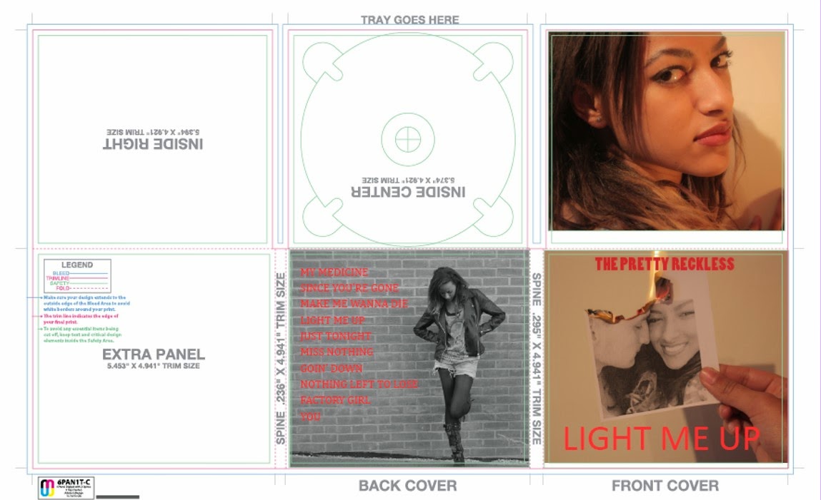
I have started to place my main images onto my digipak template as well as some main text including the album title, the band's name and the tack list. However, I am still unsure about which images to use for the 'inside left' and 'inside right' part of my digipak. At the moment, I feel like my 'inside left' image (on the top right hand corner of the template) may look more effective as my front cover as I think the close-up shot looks very professional. However, I also wanted an image that linked to the title of the album 'Light Me Up' which my current image of the burning photo does, therefore I may rearrange the images as I continue to develop my digipak.
Music Video Draft 3
This is another draft of my music video. From my previous draft, I have continued to make changes to and edit my green screen scenes. I have now positioned my model on the left or right of the screen, rather than in the middle of the shot so the footage behind of the flashbacks can be easily seen by the viewers. As these flashback scenes are important in my video to help tell the narrative I believe this change was necessary. I have also made my artist in colour so this contrast more with the ‘flashback’ scenes and lets the viewer know these are too separate shots. Moreover, I have altered the transparency and opacity tools, so my artist doesn’t fade in the shot and she is clearly the main part of the scene. I feel my music video is now looking more professional, however I still have some changes to make in terms of brightness and I would also like to include a wider range of shots if possible.
Wednesday 25 March 2015
Evaluation Question 2 Draft
How effective is the combination of your main product and ancillary tasks?
For my A2
Media Coursework, I was required to create a music video as my main product
along with my other ancillary tasks: the magazine album advert and the digipak.
To make the combination of these tasks effective, I wanted to keep a similar theme
and house style in order to make it clear that each product is promoting the
same artist and also to suit my chosen music genre: rock.
The purpose
of my main task is to promote the single as well as to help the fans connect to
the band, whereas existing fans will continue to idolise the main female
singer. Using a heartbreak narrative along with close-up shots of the artist displaying
her sad emotions will give the fans more of an insight to the song yet the fans
will also expect a typical rock artist appearance, as the song is by a rock
band. In my music video, I presented my model as a typical female rock artist –
this included her wearing a typical rock outfit such as a skull vest top with
shorts, black tights and black biker boots. She also wore heavy dark make-up
and the colours I included in my video were also quite dull, giving an overall
dark theme. For example my time lapse in London was taken in the dark at a
later time in the day. I feel this highlighted a sad theme within my video,
therefore linked to the narrative. Dull colours are also quite common to find
in rock music videos, as opposed to bright colours which will normally you
would be expected to find in a pop music video. Red was also a main colour
within my video as the painting scenes included many close-up shots of a rose,
an iconic romance prop. For my album advert poster and digipak I also used dark
colours such as black and dark red to link to the theme and start to create a particular
house style. Using this type of lighting within my video as well as these particular
colours within my main task and my ancillary tasks also helps portray the rock
music genre.
I believe
the main role of my magazine album advert is to stand out to the reader, and
instantly give off the impression that it is advertising a rock music album. It
will also need to include relevant information such as the release date, the
platforms it is available on and reviews from respectable and trustworthy music
magazines like The Rolling Stone and Mojo. I feel my poster serves these
purposes as it includes an intriguing image of a rose/photo on fire which
instantly links to the tile of the album ‘Light Me Up’. This image is also
quite unique, in the sense it is not simply an image of the artist, which many
album posters are, but rather an interesting object. This is also a concept
quite commonly used for rock genre advertisements as the band’s appearance and
how attractive they are normally isn’t important. I have also used fire in
other images which appear on my digipak to highlight that these products are
all promoting the same album. As well as similar images, I have also used the
same fonts to again display a particular house style.
In my
opinion consumers who purchase digipaks are normally dedicated fans of the
artist, especially as today most music is normally purchased online, therefore
I believe the digipak should be more personal but still include typical rock
genre conventions. For my digipak I have included images of the main female
artist as I believe she will be a main selling point in regards to the band. In
these images my model is also wearing the same outfit she wore for the music
video, linking both tasks together and highlighting the rock image. Many of
these images are also in black and white, as from previous research into the
rock genre products including past digipaks from the actual band The Pretty
Reckless, many of them use black and white photos. I have therefore edited
pictures of my model in black and white, however I have also included other
significant images of other objects, for example a rose. This combines all of
my tasks effectively as close-up shots of a rose have also been used in my
music video. Referring back to the personal aspects of digipaks, I have also
included a message for the fans on the inside of the digipak. This is a typical
convention of digipaks for all types of music genre and the font that I have
used, especially on the cover of my digipak, are the same fonts presented on my
poster.
Therefore I
think the combination of my music video along with my ancillary tasks are
effective as they all work well together and it is clear they all belong to the
same band by the house style, including the same fonts and the same colour
scheme. They also give off the impression that they belong to the rock genre
because many rock genre products use dark colours, images of women normally
wearing quite controversial outfits to appeal to the male fans and relevant and
appropriate props on their digipaks and posters, rather than images of the band
themselves.
Overall, I
believe both my main and my ancillary tasks portray a particular genre by the
type of style they present through the selection of images, colours and fonts.
Thursday 12 March 2015
Anamatic
This is the anamatic for my music video. To create my anamatic I used my storyboard by cropping the storyboard into separate images for each shot and then importing this into premiere Pro. I made sure I kept to the information I had previously written on my storyboard, for example how long a particular shot would last. I feel the anamatic gives a more realistic and vivid interpretation of what my music video will look like, compared to my storyboard.
Tuesday 10 March 2015
Editing Software
Adobe Premiere Pro
I have used this software to edit my footage, using a wide range of tools that are available on the programme. Premiere Pro has been very useful when it came down to my editing process, as it allowed me to use different layers for different sections of my music video. For example, when I had to remove the green background from my green screen shots I had to use different layers as well as other tools including the 'eight.Garbage matte' tool, the ultra key effect and the shadow and soften tools. These are new tools I have learnt about during my A2 coursework, highlighting how I am constantly learning new skills and how to effectively work with the programme. I was also able to change my footage to black and white by selecting one of the video effects. Thanks to the type of tools I had access to from this editing software, it made my work process easier to manage, however as I am still improving my music video, there are still more tools and fucntions left to discover - especially to do with the lightning.


Adobe Photoshop
I am currently using Photoshop to edit the photos I am using for my magazine advert and digipak. As I am already familiar with this software from AS, I feel as though Photoshop is an effective programme to use as it includes a wide range of tools such as the magic wand tool to remove backgrounds and the clipping and cropping tools. I have recently been working with the eraser tool after changing my images to back and white to keep some of the image in colour. I believe this will make my the photos on my digipak/advert stand out more, and look more interesting than a simple black and white photo. Photoshop will also be useful when I do touch ups on my photos, before placing them into Indesign where I will create the structure and overall layout of my two ancillary tasks - my magazine advert and my digipak.


This is another programme I am familiar with from AS, perhaps even more so than Photoshop as this is where I spent most of my time creating my music magazine for my coursework therefore I am familiar with many of the tools. I am currently using InDesign to create the template for my digipak as well as import photos I have previously edited from Photoshop. I am also using InDesign to create my magazine advert. In both of my ancillary tasks, I have found the texts tools very useful as I can choose an appropriate font as well as use the tracking tool to space the characters out so they look effective on the product. I will also be able to wrap the text around any images in this programme using the text wrap tool, and I am hoping to use this for the back cover of my digipak where the songs from the album will be listed.


I believe this post will continue to help me with all of my tasks by reminding me of the tools I will be able to use in order to improve my work. This post also highlights the ways I have already used these programmes at this stage of my coursework.
I have used this software to edit my footage, using a wide range of tools that are available on the programme. Premiere Pro has been very useful when it came down to my editing process, as it allowed me to use different layers for different sections of my music video. For example, when I had to remove the green background from my green screen shots I had to use different layers as well as other tools including the 'eight.Garbage matte' tool, the ultra key effect and the shadow and soften tools. These are new tools I have learnt about during my A2 coursework, highlighting how I am constantly learning new skills and how to effectively work with the programme. I was also able to change my footage to black and white by selecting one of the video effects. Thanks to the type of tools I had access to from this editing software, it made my work process easier to manage, however as I am still improving my music video, there are still more tools and fucntions left to discover - especially to do with the lightning.
Adobe Photoshop
I am currently using Photoshop to edit the photos I am using for my magazine advert and digipak. As I am already familiar with this software from AS, I feel as though Photoshop is an effective programme to use as it includes a wide range of tools such as the magic wand tool to remove backgrounds and the clipping and cropping tools. I have recently been working with the eraser tool after changing my images to back and white to keep some of the image in colour. I believe this will make my the photos on my digipak/advert stand out more, and look more interesting than a simple black and white photo. Photoshop will also be useful when I do touch ups on my photos, before placing them into Indesign where I will create the structure and overall layout of my two ancillary tasks - my magazine advert and my digipak.
Adobe InDesign
This is another programme I am familiar with from AS, perhaps even more so than Photoshop as this is where I spent most of my time creating my music magazine for my coursework therefore I am familiar with many of the tools. I am currently using InDesign to create the template for my digipak as well as import photos I have previously edited from Photoshop. I am also using InDesign to create my magazine advert. In both of my ancillary tasks, I have found the texts tools very useful as I can choose an appropriate font as well as use the tracking tool to space the characters out so they look effective on the product. I will also be able to wrap the text around any images in this programme using the text wrap tool, and I am hoping to use this for the back cover of my digipak where the songs from the album will be listed.
I believe this post will continue to help me with all of my tasks by reminding me of the tools I will be able to use in order to improve my work. This post also highlights the ways I have already used these programmes at this stage of my coursework.
Contact with the Band/Artist

This is the email I sent to the record label 'Interscope' which currently manages the band 'The Pretty Reckless'. As I have used their song in my music video, I am required to ask permission in order to use this particular song in my own work. In the email I have simply stated that the song will appear in my own production work as part of my A2 Coursework.
Monday 9 March 2015
Photographs of Chosen Locations


These are the fields situated near to my house where I filmed the flashbacks of the couple. These involved both of my actors acting like a typical couple, and the filming took place on all different sections of the field.

This is a photograph of the a section of the living room in my house and how I set it up for the painting scenes. This is also where I filmed my actor against the wall and was able to create the shadow effect with the help of the lights.
Question 4 Evaluation Draft
4- How did you use media technologies in the construction and research, planning and evaluation stages?
I believe media technologies have played one of the most important roles during my media A2 coursework. This is due to the access of a wide variety of advance technologies we currently have, that allow us to produce professional looking media pieces aimed at a specific target audience.
In terms of the hardware I used for my coursework, the digital Canon 550D SLR camera was the main technological equipment I used for the creation of both my main and ancillary tasks. The different features of the camera meant I was able to shoot in low quality lightning and still make my work look professional and proficient. This was due to the wide aperture, which creates a shallow focus and allows me to shoot in dark locations such as the drama studio. Other useful features include the shutter speed of the camera. Filming in low light conditions means I could also film at a lower shutter speed where less light is needed. However for the construction of my music video, I tried to keep the shutter speed low, at around 1/50, which creates a sharper and better quality image. Changing the lens of the camera for different sections of my music video also determines the fact of whether I could zoom or not. During the green screen and drama studio shoots, my only focus was on my actor therefore I used a 50mm 1.8 prime lens which cannot zoom but allows more light in to focus on one aspect of my video. On the other hand, for the flashback scenes in my video, I wanted to film in a more natural and realistic setting. Therefore I chose to film parts of my video in the local field as well as my own house which focused on a variety of things including the surrounding location. Here I used a different lens for the camera where I was able to zoom.
As well as the range of features that helped me create a professional piece of work for my coursework, the digital camera as a whole included many advantages for filming. Using a digital camera rather than an analogue meant I could review my footage immediately. Therefore if I wasn’t happy with any piece of footage, I could change my actions accordingly – for example, filming from a different angle or changing the position of the lights. Having access to this type of camera also means I didn’t have to send of the images and wait for them to be sent back, resulting in a less expensive and less time consuming process. Personally, I consider this type of technology to be vital for filming a piece of work as complex as a music video, where re-shoots are often needed and a range of location are often used.
Moving onto software, Premiere Pro was the programme I used for the construction of my music video. This programme also included a wide range of features, which resulted in an easier work process. For example, the different layers allowed me to edit my green screen shots efficiently and quickly. This was achieved by adding an extra layer and adding a green screen shot that I had previous edited on top of the background image. I edited the green screen clip by changing the key colour to green and altering the shadow and soften keys. My green screen shot was of my actor miming to the song while the background shot were my couple, which I used as the flashbacks as part of the narrative. Premiere Pro also allowed me to change the speed of my clips; this was useful when fitting the footage in with the music and also for my time lapse scene at the beginning of my video. The programme also included certain video effects, for example the main one I used, which was the back and white effect – this was added to the flashbacks scenes so the audience can easily recognise these particular scenes in my video.
Indesign was the other main programme I used for the construction stage; however this was used primarily for my ancillary tasks- the magazine advert and the album digipak. Being already familiar with this type of software technology, I was able to used skills previously learnt from AS to help make my work look realistic. For my magazine advert, I was able to import images I had already taken with the Canon SLR camera and size it appropriately. As I had previously researched magazine adverts as part of my research stage, I had an accurate idea of what I wanted my final product to look like. Testing and selecting the appropriate fonts available within this programme was part of the process, and being able to use the various text tools to re-size and re-scale the text was vital in making my advert look professional.
Creating my digipak using this programme was another similar process, as I made sure I used all the advanced tools this type of technology had to offer. I imported previous images I had taken, however I edited some of these shots using Photoshop. In Photoshop I was able to change the images to black and white while still keeping some of the photo in full colour. This was achieved my adding another layer as well as using the brush tool to colour in parts of the photo I wanted to stay in colour. Overall, this was used to emphasise certain parts of the image, such as the lips, to make the digipak more unique and original while giving the audience something to focus on and grab their attention.
Referring back to the research stages of my coursework, it is still clear to see that technologies such as the ones already mentioned were also used in this early stage. The main type of technology during this section was the use of the internet to research the band of the song I had chosen for the music video, using the search engine Google. I feel by learning about ‘The Pretty Reckless’, it gave me more ideas on how to present them in my final product. I also used Youtube to watch some of their previous videos to understand how they often portray themselves towards the public. Furthermore, research into my audience was also an important part of my coursework. Using the internet to do this meant I could learn about the fans of the band as well as fans of the rock genre so I could create a successful product that which is targeted at them.
The internet also helped with the planning stages. I used the internet to search specific rock styles and looks – this helped with the costume planning for my actor. Presenting my research and planning posts on my blog was also a way I used the internet, as for example, presenting my costumes ideas was achieved through using the website Issuu. Whereas many other posts were presented using Prezi, an interactive powerpoint to display the information I had gathered as well as my ongoing ideas.
Question 1 Evaluation Draft
A2
Evaluation
1 - In what
ways does your media product use, develop or challenge forms and conventions of
real media products?
The forms
and conventions of typical media products was something I had previously researched
in the research stages, therefore I was aware of the ways these products are
normally presented. Overall, this helped me with the creation of all three
tasks – my music video, my magazine advert and my digipak.
Clearly, my
music video was my main and most difficult task of the three. This required a
lot of research including the research of famous music directors and of course,
the typical conventions of music videos as well as analysing some famous
examples. My own music video is for the song ‘You’ by the rock band ‘The Pretty
Reckless’ and focuses on both a narrative and performance to tell the story of
a break-up between a young couple. Immediately, I believe this portrays typical
conventions of a music video as generally many songs seem to be about love or
heartbreak, and there is often an obvious relation of the lyrics to the visuals
presented within the song. This is one of the aspects Andrew Goodwin discussed
when focusing on music videos. He says how these images are used to illustrate
the meaning behind the song; therefore in this way my video uses the typical
conventions as there is a strong link between my images and the lyrics about
wanting someone. This is displayed by the flashback scene of the couple and the
passionate performance by my female actor, clearly expressing her love for the
boy. As well as the relation of lyrics to visuals, Goodwin also talks about the
use of both narrative and performance. This is an aspect I have already
mentioned, which again highlights the ways in which my video lives up to
typical music video expectations. Including both a narrative and performance, I
believe makes the video more intriguing for the viewer as they can relate their
own experiences to the story yet the performance is a good way of presenting
the actor as a successful artist. A meta narrative is also something I have
included, as various camera shots displaying the rose painting overtime
concludes how my actor finally completes the painting and this is the overall
development of the main star in my video. Close ups and over the shoulder shots
were the main type of shots I used to present the painting as I believed the
fine detail of the art piece would look interesting to the viewer, and often
they would wonder how the final piece would turn out. Technical aspects is
another feature Goodwin mentions when discussing typical media conventions and
this describes the ways in how I have put my video together through camera,
mise-en scene, editing and sound…
Long shots and
mid shots of my artist were often used to display her outfit, as I feel this
was an important part of the video to show off her rock image and style. This
also links to the rock genre of the band, and brings in the representation of
my main actor overall. I believe Laura Mulvey is a vital theorist to discuss
during this aspect, as my actor can give off both a whore and Madonna persona.
The lingering shots of the actor, focusing on her figure and heavy make-up, can
give the impression that she seen as an object through the male viewers, which
Mulvey believes are the dominant audience. On the other hand, the flashbacks of
the couple portraying a healthy heterosexual relationship, suggest my actor is
the ‘Madonna’. This could be argued that my video in fact challenges typical
conventions of music videos as both sides of this concept are displayed, which
is unusual to see.
Editing is
also a major aspect of my final music video. For example, the use of the
flashbacks creates an episodic narrative. These are presented in black and
white to make the audience aware that these scenes are not part of the
chronological flow. This type of editing gives the audience more background
information to story of my music video, and therefore can create a stronger
effect on the viewers as they more easily understand the overall narrative.
My other production
task is my magazine advert. I also researched this task, with regards to other
existing magazine adverts selling new albums. Some of the typical conventions
included a main image, the artist and album name, the release date and what
specific platforms the album could be purchased from. Taking this into account,
I included all of these conventions in my own work as well as reviews from
well-known music magazines like Rolling Stone and Mojo. I feel by using well
respected magazines such as these was more appropriate for a rock band as they
are often taken more seriously than other music genres such as pop. This means
the audience are more likely to take on board the praise given by these types
of magazines.
As well as
these conventions, the image included on my magazine album was considerably the
most important feature of this product. This would primarily grab the reader’s
attention, plus the link the image has to the album’s title was also an
important aspect I considered. I wanted to include an image which included
fire, which would link well with the name ‘Light Me Up’. Therefore the flames
in the hands was not only a technically impressive and intriguing image, it
also would make the band’s album more memorable for the audience. Taking this
into account, I firmly believe my magazine advert as a whole uses the typical
forms and conventions of the real media products.
Finally, my
digipak was my third media product I created as part of my A2 coursework.
Again, research into this product was vital as I feel digipaks are quite
difficult to design without any previous knowledge as they are more complex and
detailed. I started my using a similar image to my magazine advert, as I
believe the fire concept is a main selling point regarding the album. Having both
a rose and a photograph on fire gives the digipak a type of house style that
makes the audience aware that these images all make up the same product. The
same font from the magazine advert is also used for the band’s name – again
highlighting the house style and how the band will be recognisable to
consumers.
Thursday 5 March 2015
Planning/Drafting for Album Advert

This is an image I created in Photoshop using my original photo I took of my model holding I rose. In Photoshop I created the fire effect by using a range of layers, adding the glow tool, alternating the colours and using the magic wand tool to remove the background. I may use this for my magazine album advert, however I feel the fire looks too strong and perhaps a bit fake therefore I may use one of the photos I previous took of a flame going through a rose.
Thursday 26 February 2015
Music Video Draft 2
This is the first complete draft of my music video. From my previous draft, I have completed editing the entire song as well as changing some aspects from my previous draft. As well as finishing my video, I have changed the green screen scenes by adding the black and white effect as well as an antique effect to make it look more like a projector. However, I still believe these scenes need improving and I am not happy with the overall look yet. I always want to add some shots of other significant props such as a rose and a photograph of the couple. I will shoot these within next week, so I can perhaps add them to my video.
Monday 9 February 2015
Production Diary
This week I have created my first full draft of my music video. During this process I continued to discover a wide range of tools within the programme Premiere, especially the ones regarding the green screen scenes. These proved the most difficult to edit as there was a lot more effects to be added/controls to be adjusted - the process is also much more time consuming however I am hoping the overall look of my video will be worth it.
As you can see from my previous draft, I have focused particularly on the green screen shots as these are the ones I have edited/changed the most by adding black and white effects as well as a vintage look. I feel this way the green screen shoots will fit in more with the overall theme of my video.
As half term is fast approaching, I am also taking this opportunity to film. By filming, I specifically mean any re-shoots as well as a small photo-shoots of images that may appear on my digipak and album poster. I already have strong ideas for both of these products, I simply just have to take some photos to complete my task.
Friday 9 January 2015
Music Video Draft
This is my first draft of the first 2 minutes of my music video. As you can see, there is still a lot to improve. At the moment the green-screen scenes are not yet complete as I still need to add effects to give a vintage projection look as if the flashbacks are being shown on her body, as well as in the background. This is why you can sometimes not see both actors when they are behind the singer (when I finish my video, the audience will later be able to see them both due to the effects I later add). Furthermore, I still need to add an opening shot which is likely to be a photo of the couple.
Drafting my work will help me reflect back on my progress during the year and the amount of changes I make during the editing process of my video.
Wednesday 7 January 2015
Storyboard


In my storyboard I have drawn and written what I would roughly want my final music video to look like. In my storyboard I have included my original ideas of the flashbacks and the painting however I may have changed some of these in my actual video and include more/fewer shots therefore my storyboard may not be an exact replicate of my final video. However this has helped me to visual my ideas and decide where I would like each shot to be placed within my video and how long each shot will last etc.
Risk Assessment
This is my risk assessment/ healthy and safety evidence, highlighting all the potential risks that could occur during the production of my music video. I feel this risk assessment will help me minimise any injuries that could occur and also prepare me for any that may happen. I feel it is vital to include an assessment like this, especially within a production task as big as a music video where other people and expensive equipment is involved.
Tuesday 6 January 2015
Actor Release

My actor release clearly displays that my model (Vanessa) has agreed to the terms and conditions of appearing in my music video. This grants me permission to film her for the performances and other various scenes that will be included in my work.
Call Sheet
For my call sheet, I made a note of all the specific details of the various shoots I had planned. For example this included the locations as well as the times the shoots will take place. I also made sure I listed all the appropriate equipment so I wouldn't forget anything vital on the day. Moreover, I went into more detail about what each shoot would include as well as things I would have to prepare for beforehand- this included any time needed for setting up or getting my actors ready. I feel this will help me with my music video in a huge way as I can easily prepare for the shooting using this useful sheet.
Location Release

This is the location release I had to get my teacher to agree to and sign, before I started filming my music video in the locations listed above, such as the drama studio and the classroom where I had access to the green screen. This location release clearly states the different terms and conditions which I had to comply to in order to use the locations at my school and have access to them for part of my A2 coursework.
Subscribe to:
Posts (Atom)